On this tutorial i’m going to show how you can build a custom reusable dialog component in Power Apps.
Unfortunately power apps currently dosen’t allow us to expose actions like OnSelect of buttons, so we can’t have buttons in the dialog.
While this make our component buttonless it’s not an issue to add our ok cancel buttons later on our view, we still get the benefits to have a reusable modal dialog without resorting to copy and paste and fixings.
Creating the Dialog Component
So to get start create an app or open an existing one and click on the component tab.
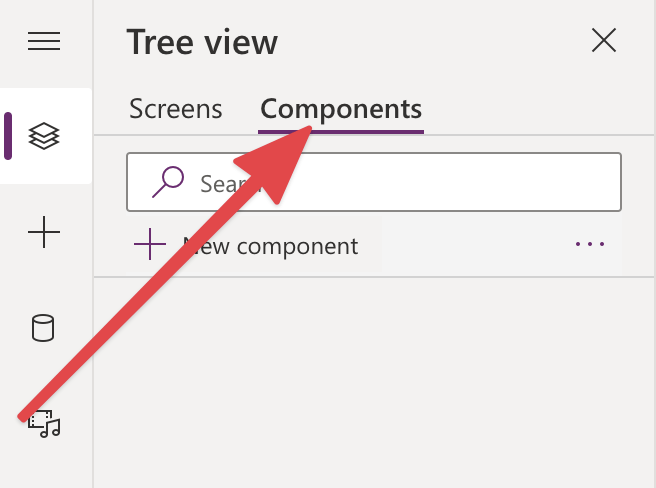
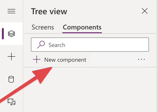
Now click on New component.
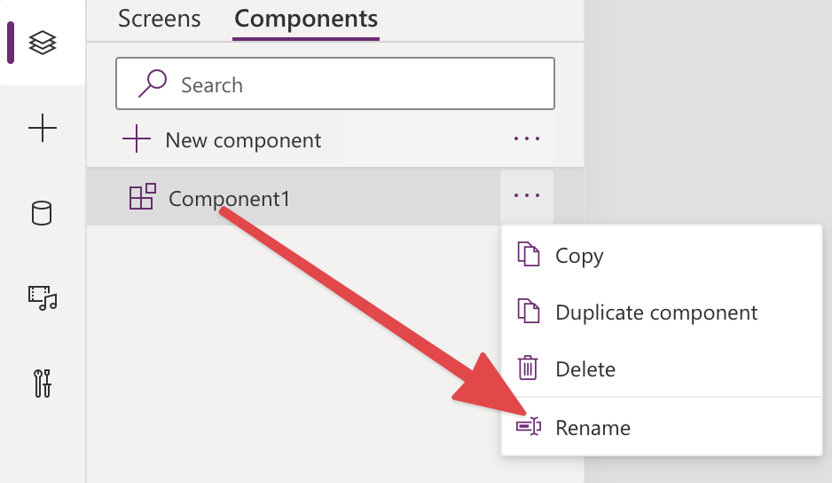
As you can see a new component is created with the name Component1, we can rename our component to DialogComponent by clicking on the three dots on the right, and click on the Rename menu.
Adding the component properties
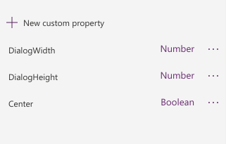
Now that we have our component named correctly we can proceed to create a few custom properties. You can find the custom property panel on the right side.
We are going to define three properties as following.
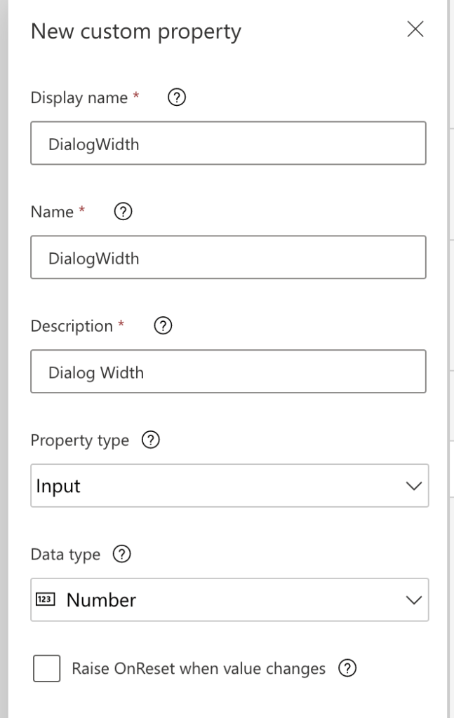
Start by clicking on the New custom property button it should open a dialog, and fill it like in the following screen
Repeat the same think for the following properties, remember that you need to specify the correct Data Type for the property, the description field is up to you
- DialogHeight of Data Type Number
- Center of Data Type Boolean
So now you should have all the properties ready, so we can proceed to create our dialog UX.
Add a Modal background
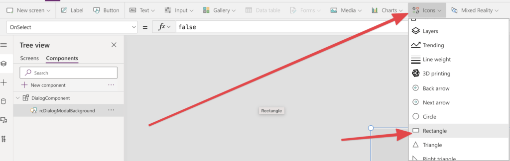
So back on the canvas of your component, we need to create a background to cover our app when we open our Dialog. To do so create a new rectangle you can call it rcDialogModalBackground.
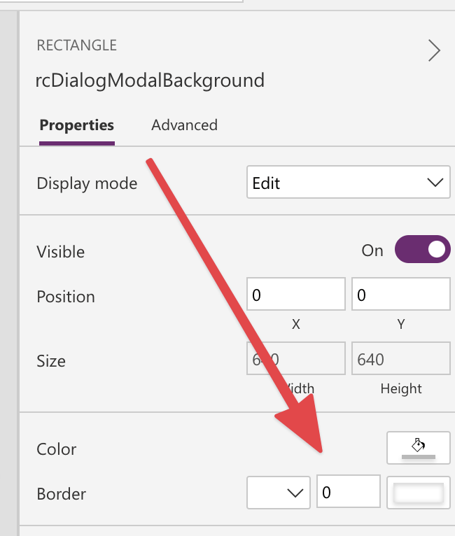
To make sure our component is correctly filling the screen we need to check it’s Width and Height property are set to match it’s parent size like so.


Also make sure X and Y are set to 0.
We also need to make sure we have no border in our background rectangle.
If you want it to be semi transparent so it will show the content underneath, you can change the Fill property of the rectangle like so.

Currently if you test this component when you will mouse over it or click it will probably show a different fill color this is because shapes also react to mouse over and click events and use different’s property to pick the fill color, so add the color value you added on Fill to HoverFill and PressedFill.
Creating the Dialog Content Area
Now you can proceed to create a new Rectangle with all Fill, HoverFill and PressedFill set to a white color.
Right now the Dialog Content Area where we are going to add our buttons later is not resizing or aligning based on our custom properties, to fix that, please fill the properties as follow.


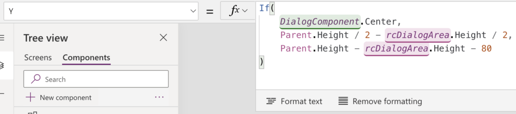
As you can see the Y formula is a little more complex, this is because we are using the Center property previously defined to change our vertically alignment behaviour. Basically if the Center is True we center our dialog content in the screen, otherwise we align this on the bottom of the parent size minus 80.
Change these as you wishes. Our Dialog Component is ready for testing.
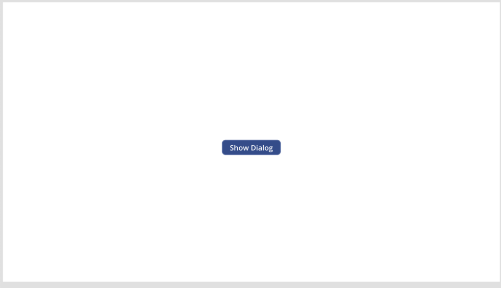
Testing our Dialog Component
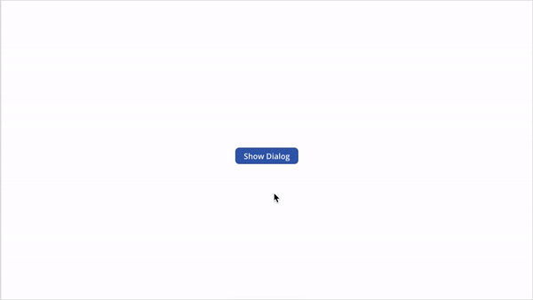
Add a new button on the canvas that we are going to use it to show our dialog again. And set the OnSelect Expression as follow.

Should look like this now.
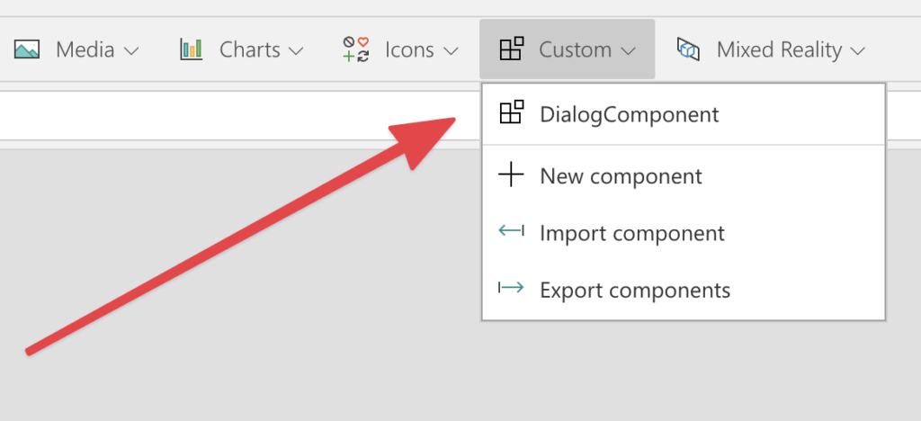
To test our new component we first need to add it to one of our canvas apps screen, to do so click on the custom menu in your power apps toolbar.
Then click on Dialog Component to add a new instance.
Now all you need to do is to resize it to fill the screen, and set the DialogWidth and DialogHeight to a bigger size, i’m going to use 500 for the Width, and 350 for the Height.
Now add a button on it’s white content Area so we can close the dialog.
The on the button OnSelect Event add the following expression.

Now we need to add ShowDialog variable on Both the Button and DialogComponent instance Visible property.
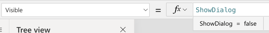
Now both the Dialog and the button will disappears, it is expected to do so because by default ShowDialog is going to be set as false.
Now it play and enjoy you new reusable Dialog. Maybe in a future PowerApps release we can also add buttons as part of the component to maximise reusability!